
I've been agonizing over it for a while, drawing mock-ups on scrap pieces of paper. 2 columns? 3 columns? New colors? New header graphic? Ugh. It's all a bit much.
My eyes are about to go crossed from all the HTML. One thing I've learned...I am not a programmer. And neither are some of the people who post programming instructions on the internet, thankyouverymuch.
But this is the new look, at least for a while. I don't think I can stand any more rearranging any time soon.


Not a fan of the new look.
ReplyDeleteM3
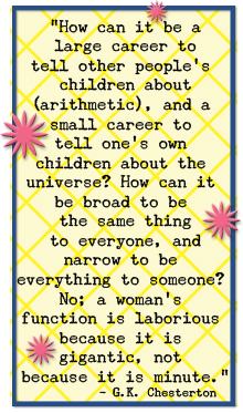
OK...M3. I figure Superchikk cares about your opinion - a little, maybe... Surely you have an opinion to improve the look if you have an objection. I like the fact that the quote is now in the block on the side...it always bothered me that is was so big within the header. I wish the words that are "links" were a different color - b/c that shade of blue is so hard for this old lady to see. There's my first 2 cents.
ReplyDelete